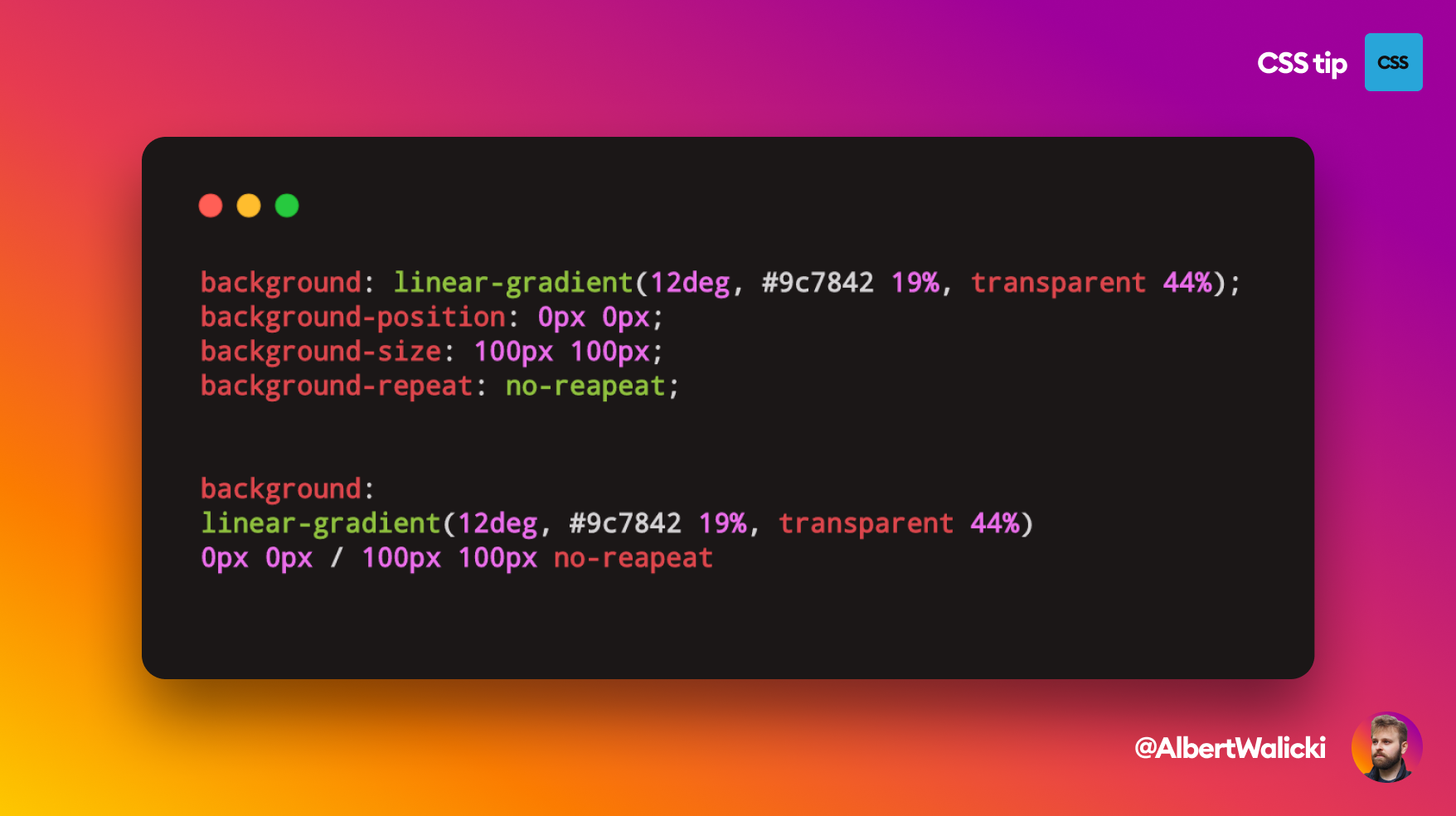
We can replace four lines of code with only one using shorthands!
Before:
background: linear-gradient(12deg, #9c7842 19%, transparent 75%);
background-position: 0px 0px;
background-size: 100px 200px;
background-repeat: no-repeat;
After:
background: linear-gradient(12deg, #9c7842 19%, transparent 75%) 0px 0px / 100px
 200px no-repeat;
Let's see what is going on here:
- first of all, we are using background property
- first part is our gradient
- second part is our position of the background
- then we have a position-size separator
- after the separator, we have background-size
- the last part is property repeat
This is not over! Background can have more properties:
background:
   url(path_to_image.png) /* image */
   top center / 50px 50px /* position / size */
   no-repeat              /* repeat */
   scroll                 /* attachment */
   content-box            /* origin */
   padding-box            /* clip */
   black;                 /* color */
Background shorthand is necessary while creating single-div illustrations.