Aurora UI - how to create with CSS
Design trends are creating like a new javascript framework. Some of them are good and accessible to all users, and some of them are not.
 Albert Walicki · frontend developer in Gdańsk
Design trends are changing like new javascript frameworks - at least one a day. 😄 Today I would like to introduce you to another trend named by my friend Michal Malewicz. it’s called Aurora UI, and you can find here an article written by Michal.
let’s take a look at it.
What is the Aurora trend?
This trend is not that new. For example, Stripe has been using it in their header for a long time. it’s getting more popular on services like Dribbble or Behance.
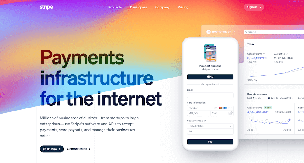
it’s characteristic features are:
- blurred shapes
- similar colours
- smooth transitions between colours
How to create it with CSS?
There are at least three ways to create this effect.
- blurred shapes
- blurred gradients
- blurred images
Blurred shapes
The first method is to create three ovals overlaying on each other. Create big ones and position them:
- first one on the top of the container
- two in the bottom corners
Then we need to add filter: blur() and lower the opacity slightly.
<div class="wrapper">
  <div class="base one"></div>
  <div class="base two"></div>
  <div class="base three"></div>
</div>Radial gradient
The second method is to use gradient colours! Instead of solid colours, we can use a radial-gradient to create our effect.
let’s add three radial-gradients from a solid colour to transparent:
- top left
- top right
- bottom left
<div class="wrapper"></div>Blur an image
The easiest way to create this effect is... to choose a good image and add some filter: blur(). 😄
<div class="wrapper">
  <img src="ourImg.png"/>
</div>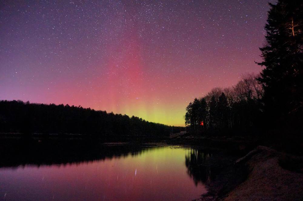
Animated background
You can also animate your backgrounds to make them look better! Here is a small example of rotating backgrounds. 🚀
I used transform:rotate(1turn) translate(100px) rotate(-1turn); to create movement on the circle path.
<div class="wrapper">
  <div class="base one"></div>
  <div class="base two"></div>
  <div class="base three"></div>
</div>You can play with all backgrounds here. 💪
And that’s it! You can combine Aurora with glassmorphism to create an even better UI.
Thanks for reading!