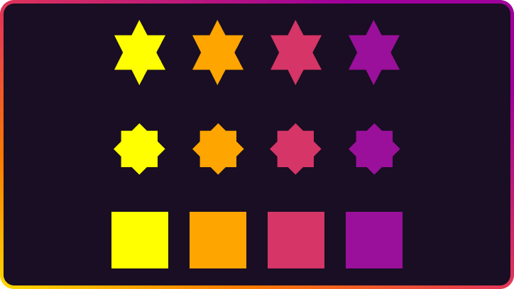
Making various shapes in CSS is easy. Squares and rectangles are the most common and natural shapes in web development. You need to add width and height, and that’s it. First two shapes are created. Adding border-radius and you have circles and ovals.
More complex shapes require to add :before and :after pseudo-elements or more HTML. That gives us two more shapes to create something complex. In terms of creating different shapes, your best friends will be transform and position.
Most of the shapes below designers would export as an image, but as we know - we should replace simple images with CSS to speed up our website.
Keep in mind: all shapes were built with box-sizing: border-box; on the body!
let’s start with basic shapes.
Basic shapes Square shape html css
< divclass = " square" > </ div> .square {
width : 80px;
height : 80px;
background : orange;
} Rectangle shape html css
< divclass = " rectangle" > </ div> .rectangle {
width : 200px;
height : 80px;
background : orange;
} Circle shape html css
< divclass = " circle" > </ div> .circle {
width : 80px;
height : 80px;
border-radius : 50%;
background : orange;
} Elipse shape html css
< divclass = " circle" > </ div> .circle {
width : 160px;
height : 80px;
border-radius : 50%;
background : orange;
} Isosceles triangle shape html css
< divclass = " isosceles_triangle" > </ div> .isosceles_triangle {
width : 0;
height : 0;
border-style : solid;
border-width : 0 100px 100px 100px;
border-color : transparent transparent orange transparent;
} Triangle up shape html css
< divclass = " triangle_up" > </ div> .triangle_up {
width : 0;
height : 0;
border-style : solid;
border-width : 0 50px 86.6px 50px;
border-color : transparent transparent orange transparent;
} Triangle down shape html css
< divclass = " triangle_down" > </ div> .triangle_down {
width : 0;
height : 0;
border-style : solid;
border-width : 86.6px 50px 0 50px;
border-color : orange transparent transparent transparent;
} Triangle left shape html css
< divclass = " triangle_left" > </ div> .triangle_left {
width : 0;
height : 0;
border-style : solid;
border-width : 50px 86.6px 50px 0;
border-color : transparent orange transparent transparent;
} Triangle right shape html css
< divclass = " triangle_right" > </ div> .triangle_right {
width : 0;
height : 0;
border-style : solid;
border-width : 50px 0 50px 86.6px;
border-color : transparent transparent transparent orange;
} Triangle top left shape html css
< divclass = " triangle_top_left" > </ div> .triangle_top_left {
width : 0;
height : 0;
border-style : solid;
border-width : 100px 100px 0 0;
border-color : orange transparent transparent transparent;
} Triangle top right shape html css
< divclass = " triangle_top_right" > </ div> .triangle_top_right {
width : 0;
height : 0;
border-style : solid;
border-width : 0 100px 100px 0;
border-color : transparent orange transparent transparent;
} Triangle bottom right shape html css
< divclass = " triangle_bottom_right" > </ div> .triangle_bottom_right {
width : 0;
height : 0;
border-style : solid;
border-width : 0 0 100px 100px;
border-color : transparent transparent orange transparent;
} Triangle bottom left shape html css
< divclass = " triangle_bottom_left" > </ div> .triangle_bottom_left {
width : 0;
height : 0;
border-style : solid;
border-width : 100px 0 0 100px;
border-color : transparent transparent transparent orange;
} Trapezoid shape html css
< divclass = " trapezoid" > </ div> .trapezoid {
border-bottom : 100px solid orange;
border-left : 25px solid transparent;
border-right : 25px solid transparent;
height : 0;
width : 100px;
} Parallelogram shape html css
< divclass = " parallelogram" > </ div> .parallelogram {
width : 160px;
height : 80px;
transform : skew ( 20deg) ;
background : orange;
} Star shape - 5 points html css
< divclass = " star_5" > </ div> .star_5 {
position : relative;
width : 0px;
height : 0px;
display : block;
border-right : 100px solid transparent;
border-bottom : 70px solid orange;
border-left : 100px solid transparent;
transform : rotate ( 35deg) ;
}
.star_5:before {
content : '' ;
position : absolute;
display : block;
top : -45px;
left : -65px;
border-bottom : 80px solid orange;
border-left : 30px solid transparent;
border-right : 30px solid transparent;
height : 0;
width : 0;
transform : rotate ( -35deg) ;
}
.star_5:after {
content : '' ;
position : absolute;
display : block;
top : 3px;
left : -105px;
width : 0px;
height : 0px;
border-right : 100px solid transparent;
border-bottom : 70px solid orange;
border-left : 100px solid transparent;
transform : rotate ( -70deg) ;
} Star shape - 6 points html css
< divclass = " star_6" > </ div> .star_6 {
width : 0;
height : 0;
border-left : 50px solid transparent;
border-right : 50px solid transparent;
border-bottom : 100px solid orange;
position : relative;
}
.star_6:before {
content : "" ;
position : absolute;
top : 30px;
left : -50px;
width : 0;
height : 0;
border-left : 50px solid transparent;
border-right : 50px solid transparent;
border-top : 100px solid orange;
} Star shape - 8 points html css
< divclass = " star_8" > </ div> .star_8 {
background : orange;
width : 80px;
height : 80px;
position : relative;
transform : rotate ( 20deg) ;
}
.star_8:before {
content : "" ;
position : absolute;
top : 0;
left : 0;
height : 80px;
width : 80px;
background : orange;
transform : rotate ( 135deg) ;
} Star 12 points html css
< divclass = " star_12" > </ div> .star_12 {
background : orange;
width : 80px;
height : 80px;
position : relative;
}
.star_12:before,
.star_12:after {
content : "" ;
position : absolute;
top : 0;
left : 0;
height : 80px;
width : 80px;
background : orange;
}
.star_12:before {
transform : rotate ( 60deg) ;
}
.star_12:after {
transform : rotate ( 30deg) ;
} Pentagon shape html css
< divclass = " pentagon" > </ div> .pentagon {
position : relative;
width : 90px;
border-width : 50px 18px 0;
border-style : solid;
border-color : orange transparent;
}
.pentagon:before {
content : "" ;
position : absolute;
height : 0;
width : 0;
top : -85px;
left : -18px;
border-width : 0 45px 35px;
border-style : solid;
border-color : transparent transparent orange;
} Hexagon shape html css
< divclass = " hexagon" > </ div> .hexagon {
width : 100px;
height : 55px;
background : orange;
position : relative;
}
.hexagon:before {
content : "" ;
position : absolute;
top : -25px;
left : 0;
width : 0;
height : 0;
border-left : 50px solid transparent;
border-right : 50px solid transparent;
border-bottom : 25px solid orange;
}
.hexagon:after {
content : "" ;
position : absolute;
bottom : -25px; left : 0;
width : 0;
height : 0;
border-left : 50px solid transparent;
border-right : 50px solid transparent;
border-top : 25px solid orange;
} Octagon shape html css
< divclass = " octagon" > </ div> .octagon {
width : 100px;
height : 100px;
background : orange;
position : relative;
}
.octagon:before {
content : "" ;
position : absolute;
top : 0;
left : 0;
border-bottom : 29px solid orange;
border-left : 29px solid rgb ( 24, 24, 24) ;
border-right : 29px solid rgb ( 24, 24, 24) ;
width : 42px;
height : 0;
}
.octagon:after {
content : "" ;
position : absolute;
bottom : 0;
left : 0;
border-top : 29px solid orange;
border-left : 29px solid rgb ( 24, 24, 24) ;
border-right : 29px solid rgb ( 24, 24, 24) ;
width : 42px;
height : 0;
} Diamond shape html css
< divclass = " diamond" > </ div> .diamond {
width : 0;
height : 0;
border : 50px solid transparent;
border-bottom : 70px solid orange;
position : relative;
top : -50px;
}
.diamond:before {
content : '' ;
position : absolute;
left : -50px;
top : 70px;
width : 0;
height : 0;
border : 50px solid transparent;
border-top : 70px solid orange;
} More advanced shapes Okay, all shapes above are pretty simple and common. let’s create something less common but also easy.
Cut diamond shape html css
< divclass = " diamond" > </ div> .diamond {
border-style : solid;
border-color : transparent transparent orange transparent;
border-width : 0 25px 25px 25px;
height : 0;
width : 50px;
position : relative;
}
.diamond:before {
content : "" ;
position : absolute;
top : 25px;
left : -25px;
width : 0;
height : 0;
border-style : solid;
border-color : orange transparent transparent transparent;
border-width : 70px 50px 0 50px;
} Plus shape html css
.plus {
width : 30px;
height : 100px;
background : orange;
position : relative;
}
.plus:before {
content : '' ;
position : absolute;
top : 50%;
transform : translateY ( -50%) ;
left : 0;
width : 100px;
height : 30px;
background : orange;
} Clover shape html css
< divclass = " clover" > < spanclass = " t_left" > </ span> < spanclass = " t_right" > </ span> < spanclass = " b_left" > </ span> < spanclass = " b_right" > </ span> </ div> .clover {
position : relative;
}
.clover span {
width : 90px;
height : 90px;
background : orange;
position : absolute;
}
.t_left {
border-radius : 50% 50% 0 50%;
left : -90px;
top : 0px;
}
.t_right {
border-radius : 50% 50% 50% 0%;
right : -90px;
top : 0px;
}
.b_left {
border-radius : 50% 0% 50% 50%;
left : -90px;
top : 90px;
}
.b_right {
border-radius : 0% 50% 50% 50%;
right : -90px;
top : 90px;
} Heart shape html css
< divclass = " heart" > </ div> .heart {
background : orange;
width : 100px;
height : 100px;
transform : rotate ( -45deg) ;
position : relative;
}
.heart:before,
.heart:after {
content : '' ;
position : absolute;
background : orange;
width : 100px;
height : 100px;
border-radius : 50%;
}
.heart:after {
top : -50px;
left : 0;
}
.heart:before {
left : 50px;
top : 0;
} Crescent shape html css
< divclass = " crescent" > </ div> .crescent {
position : relative;
width : 100px;
height : 100px;
background-color : transparent;
box-shadow : inset -12px 5px 0 3px orange;
border-radius : 50%;
} Half circle shape html css
< divclass = " half_circle" > </ div> .half_circle {
background : orange;
height : 90px;
width : 45px;
border-bottom-right-radius : 90px;
border-top-right-radius : 90px;
} Drop shape html css
.drop {
background : orange;
width : 100px;
height : 100px;
border-radius : 50%;
position : relative;
}
.drop:before {
content : "" ;
position : absolute;
top : -10%;
left : 50%;
border : 42px solid transparent;
border-bottom : 62px solid orange;
transform : translateX ( -50%) ;
} Welcome to CSS-images world! I hope that you will get familiar with CSS shapes. As you see, CSS shapes are enjoyable and easy. To test yourself, try to draw them on your own without looking in CSS code.
In the next article, we will be talking about creating bubble speeches 😎. Thanks for reading!
 Albert Walicki · frontend developer in Gdańsk