ux/ui
Call to Action button
Always prioritize one button in a group. Buttons should never look the same: make the call to action the most prominent one.
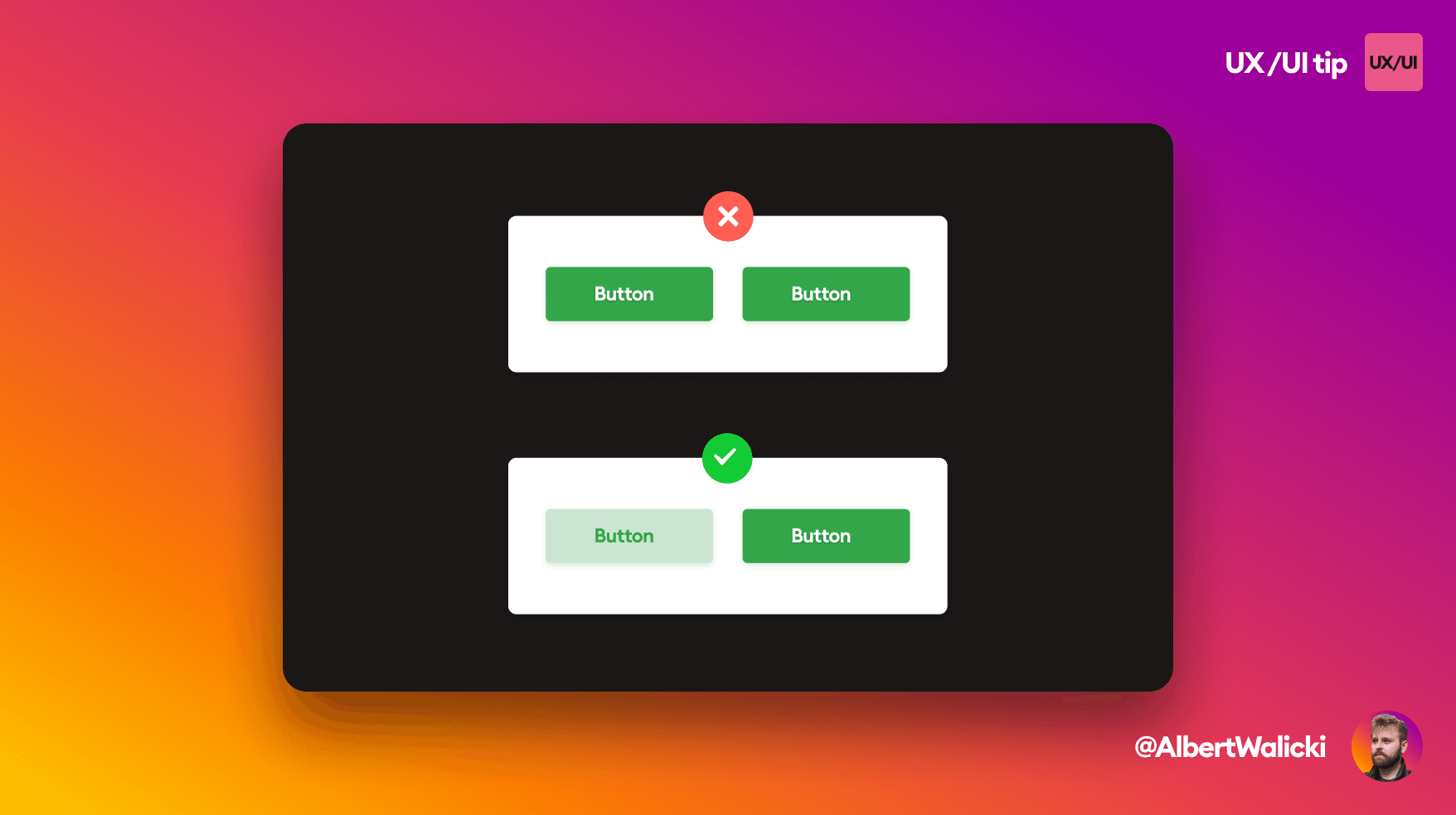
You should always visually prioritize one of the buttons. They should NEVER look exactly the same. The more important button is always CTA (call to action) and it should be more prominent.