Logo - Albert Walicki

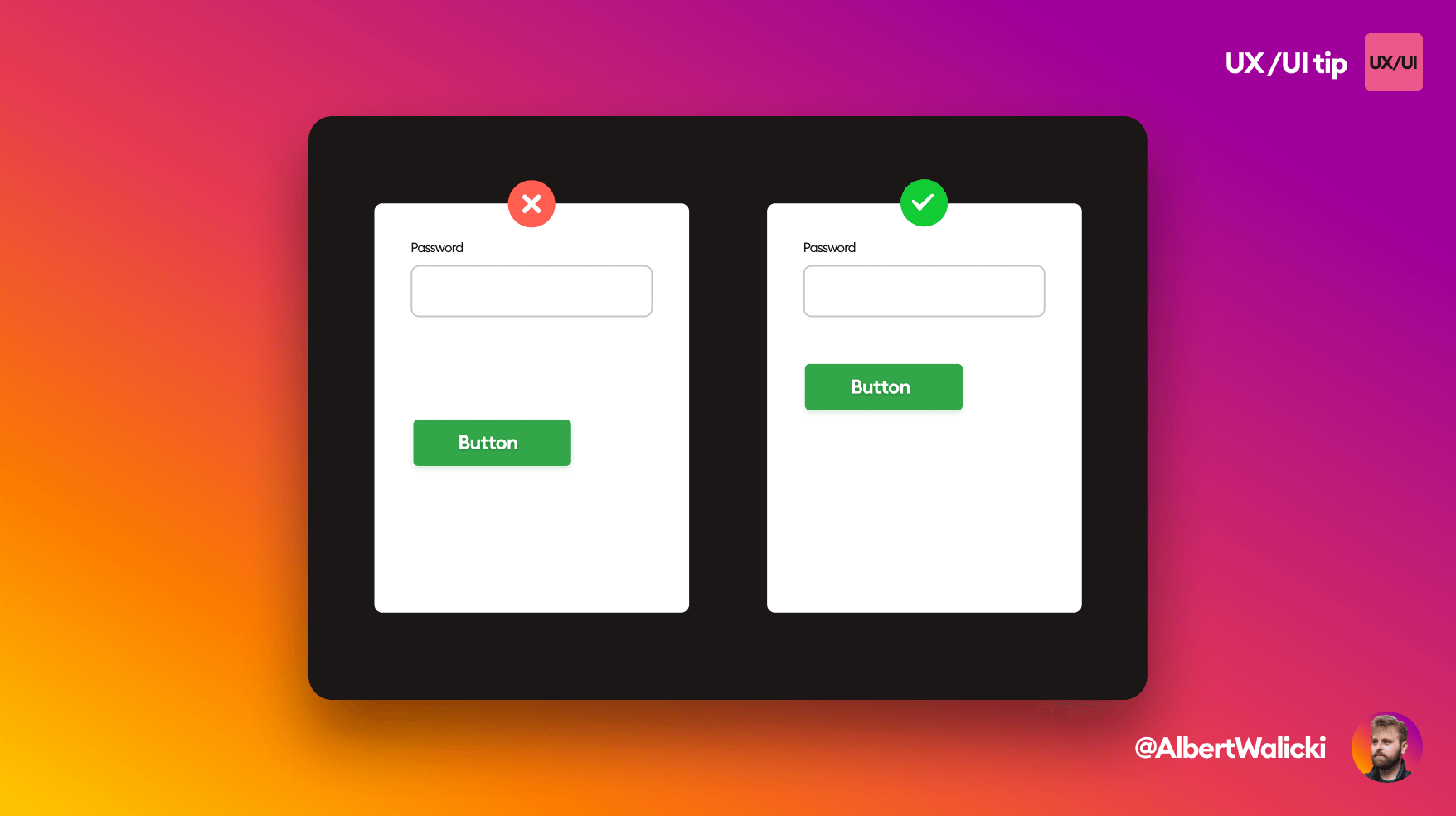
Connect button with the form

UX/UI
Two forms, on the left side wrong one and on the right side correct one

If the spacing between the last field and the button is too big, it may feel disconnected. It misleads users that the button is not what actually sends the form.

Avoid too big spaces between elements like this to have a better user experience.

See more tips!

CSS
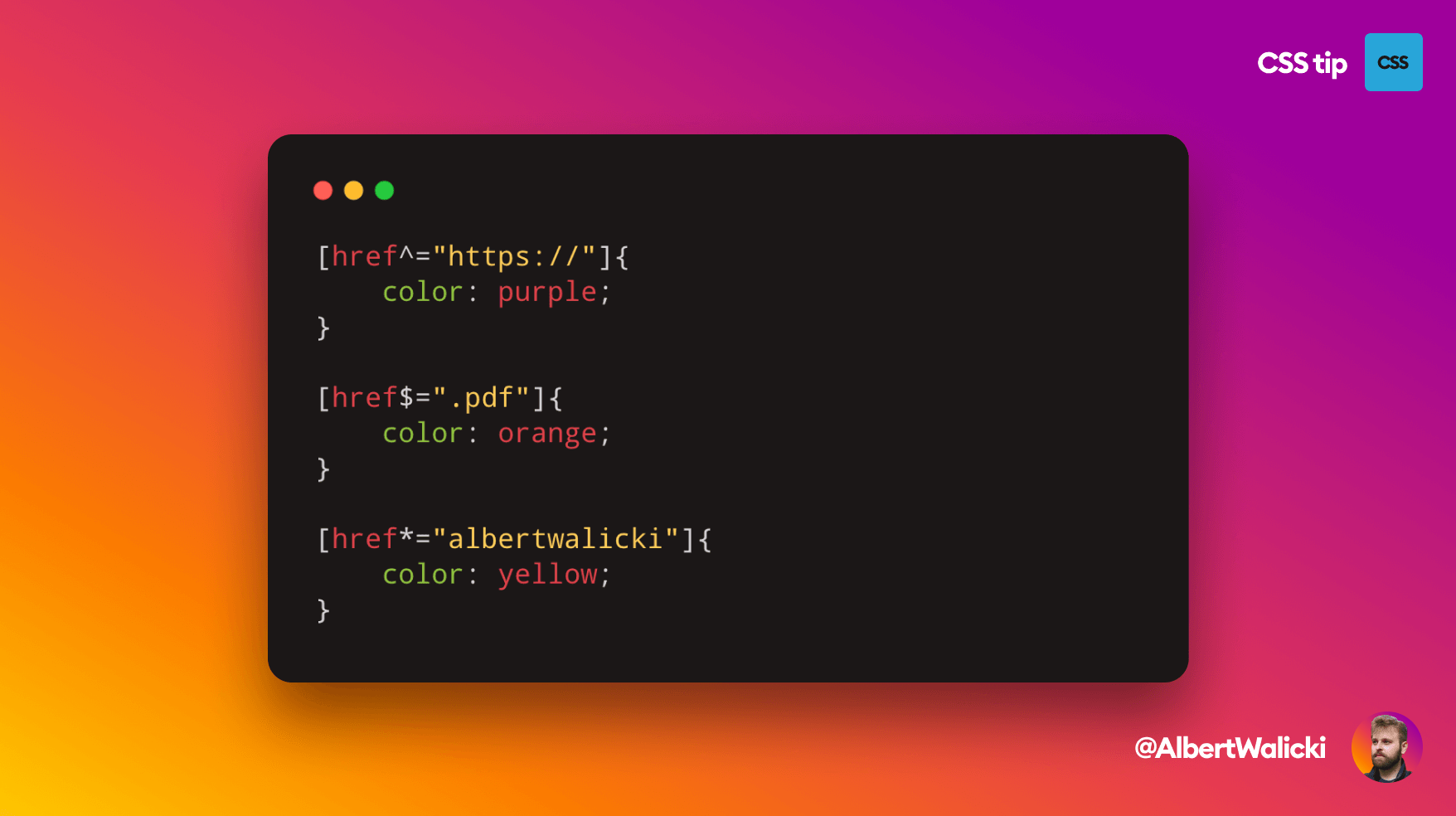
Three examples of coloring anchor tags depending on the part of the URL

Color your links with specific href

Logo - Albert Walicki

Hello, I'm a frontend developer with over six years of experience, freelancer. I'm also a mentor for junior frontend developers. I wrote a book for Junior Frontend developers called Frontend Unicorn.

BlogGlassmorphismAurora UIShapes in CSSUnique css illustrations

Get in touch!

Have a question or need a project? Contact me!

© 2020-present Albert Walicki. All Rights Reserved

Policy