ux/ui
Add some space!
In the example on the left, when the error messages are displayed, the spacing between forms makes all the fields blend into one large column.
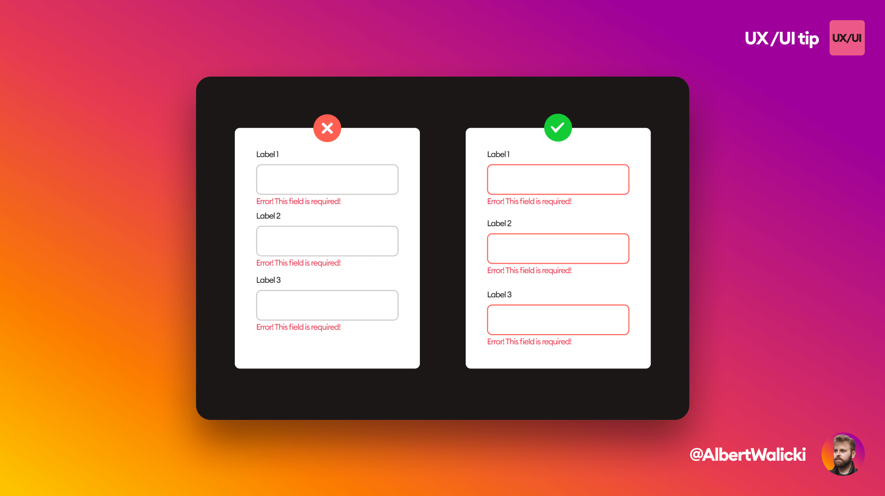
In the example on the left, when the error messages are displayed, the spacing between forms makes all the fields blend into one large column.
Add more space to separate fields and create a more precise layout!