Introduction
It’s almost the end of the year, and as you might expect, Mike Malewicz created a trend in user interfaces - Claymorphism.
This trend is getting more and more popular on Dribble and Behance. Let me introduce you to Claymorphism from a developer's point of view and explain how to create it using CSS.
What is Claymorphism?
Claymorphism creates an illusion of depth in our layouts, and it contains:
- light, pastel, and vivid colors
- big rounded corners
- double inner shadow
- outer shadow
Getting started
The requirements for this tutorial are very low, and it can be created even by aspiring junior frontend developers. All we need is HTML and a few CSS properties.
Initial markup
Let’s create a basic HTML markup:
<!DOCTYPE html>
<html lang="en">
<head>
  <meta charset="UTF-8">
  <meta http-equiv="X-UA-Compatible" content="IE=edge">
  <meta name="viewport" content="width=device-width, initial-scale=1.0">
  <title>Claymorphism CSS tutorial</title>
</head>
<body>
    <!-- Your code -->
</body>
</html>
Then let’s add some basic CSS for the body tag:
* {
  box-sizing: border-box;
}

body {
  min-height: 100vh;
  margin: 0;
  background: #D6A2FF;
  color: #2D3557;
  font-family: Arial;
  display: flex;
  justify-content: center;
  align-items: center;
}
Our starter is created. Now let’s create our card HTML markup and place it inside the body tag:
<div class="card">
  <h2 class="card-title">Claymorphism in User Interfaces</h2>
  <p class="card-text">Developer point of view</p>
</div>
Before creating the Claymorphism effect, we can apply some styles to our card to look better. Let’s start with typography, more space, and rounded corners:
.card {
width: 400px;
padding: 50px;
border-radius: 30px;
background: #ffffff;
text-align: center;
}
.card-title {
font-size: 32px;
margin: 0 0 8px 0;
line-height: 1.3;
}
.card-text {
font-size: 20px;
margin: 0;
line-height: 1.3;
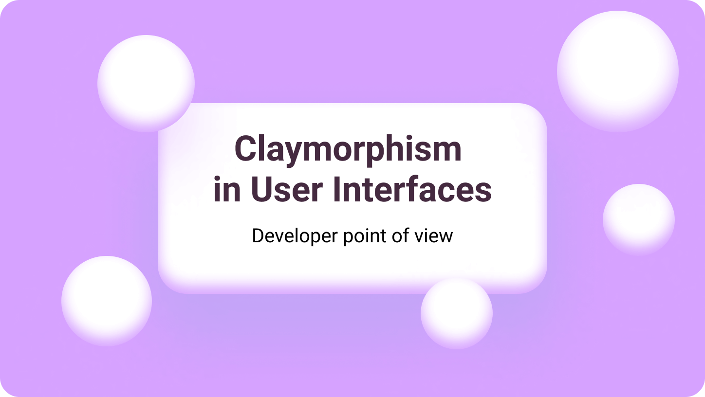
}Our result:
Claymorphism in User Interfaces
Developer point of view
Awesome! Now our basic markup is ready. Now let’s dive into box-shadow.
Box shadow - how to use it
As I mentioned before, claymorphism consists of big rounded corners and multiple box-shadows. We already have border-radius applied, so let’s focus on box-shadow.
The box-shadow property allows casting a shadow from the element. We have just one shadow in most cases, but while creating Claymorphism, we need to have at least two! It’s effortless to add more than one. All we need to do is to separate them by comma, and that’s it!
I will have one inner and one outer in my example but feel free to test how it might look with more than two shadows.
But hey, Albert! How do we create inner shadows?
It’s simple. We need to add special value inset before our shadow. This will inform our browser that this particular shadow is an inner shadow. By default, we create outer shadows.
Look at the list, what box-shadow is consists of:
- inset
- offset X
- offset Y
- blur radius
- spread radius
- color
Now you know how box-shadow works. Let’s get our hands dirty.
Claymorphism shadow effect
Finally, it’s time to create our effect. First of all, we need to add primary outer shadow, for example like this one:
.card {
  ...
  box-shadow: 0 35px 68px 0 rgba(170,63,254,0.42);
  ...
}
We already have a nice-looking but regular card.
Claymorphism in User Interfaces
Developer point of view
Then we just need to add inner shadow, like this:
.card {
  ...
  box-shadow: 0 35px 68px 0 rgba(170,63,254,0.42), inset 0 -8px 16px 0 #D6A2FF;
  ...
}Claymorphism in User Interfaces
Developer point of view
Well done! We have created the Claymorphism effect using CSS.
Browser support
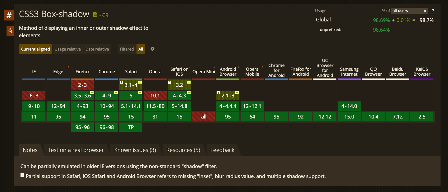
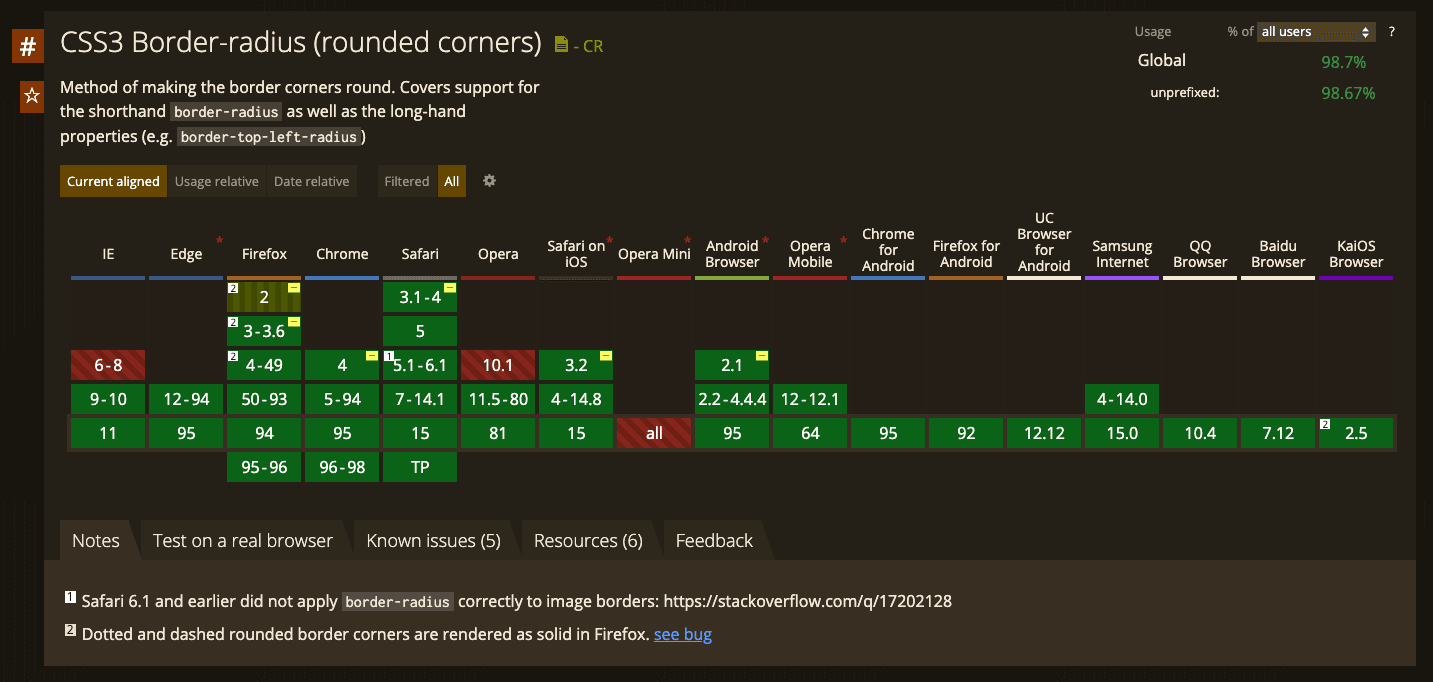
All browsers - modern ones and almost ancient like Internet Explorer 9 or 10 supports all requirements for Claymorphism - box-shadow and border-radius.
Box shadow support:
Border-radius support:
Claymorphism generator
As a part of the claymorphism journey, we created a Claymorphism Tool just for you to play! Feel free to use it.
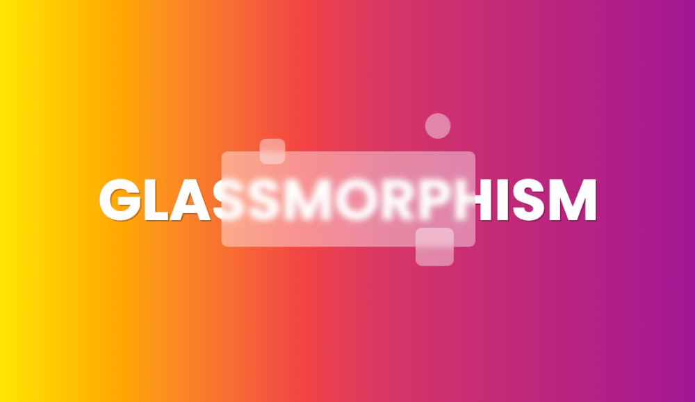
Claymorphsim + Glassmorphism
Yes! We can combine both styles to receive even better results. We simply need to add a backdrop-filter and some transparency to our white background.
.card {
  ...
  backdrop-filter: blur(15px);
  background: rgba(255,255,255, 0.4);
  box-shadow: 0 35px 68px 0 rgba(170,63,254,0.42), inset 0 -8px 16px 0 #D6A2FF;
  ...
}Claymorphism in User Interfaces
Developer point of view
Claymorphism in 2022
Claymorphism is one of the best and newest design trends. On the contrary to Neumorphism, it has no problems with accessibility and compared to Glassmorphism, and all browsers perfectly support it.
Codepen with our exercise is here.
I created also a few different examples: