Introduction
I wrote the previous version of my blog with Gatsby.js and MDX for custom components in article posts.
I have had my blog for almost one year, and I decided to rewrite everything with Next.js. I stopped working with Gatsby.js after one problem with og:images. Yes, I decided to abandon Gatsby.js only because of one thing.
I don’t remember what exactly was going on and why the problem occurred. Because of this, all my love for Gatsby ended - I had to rewrite the entire landing page for our client.
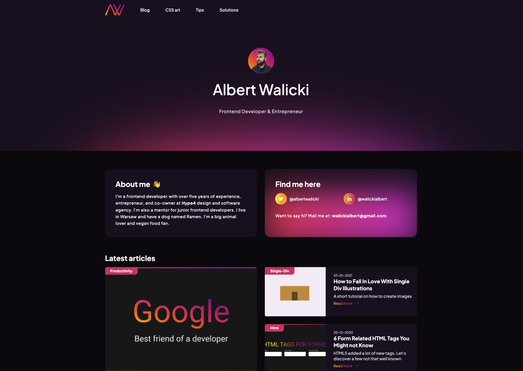
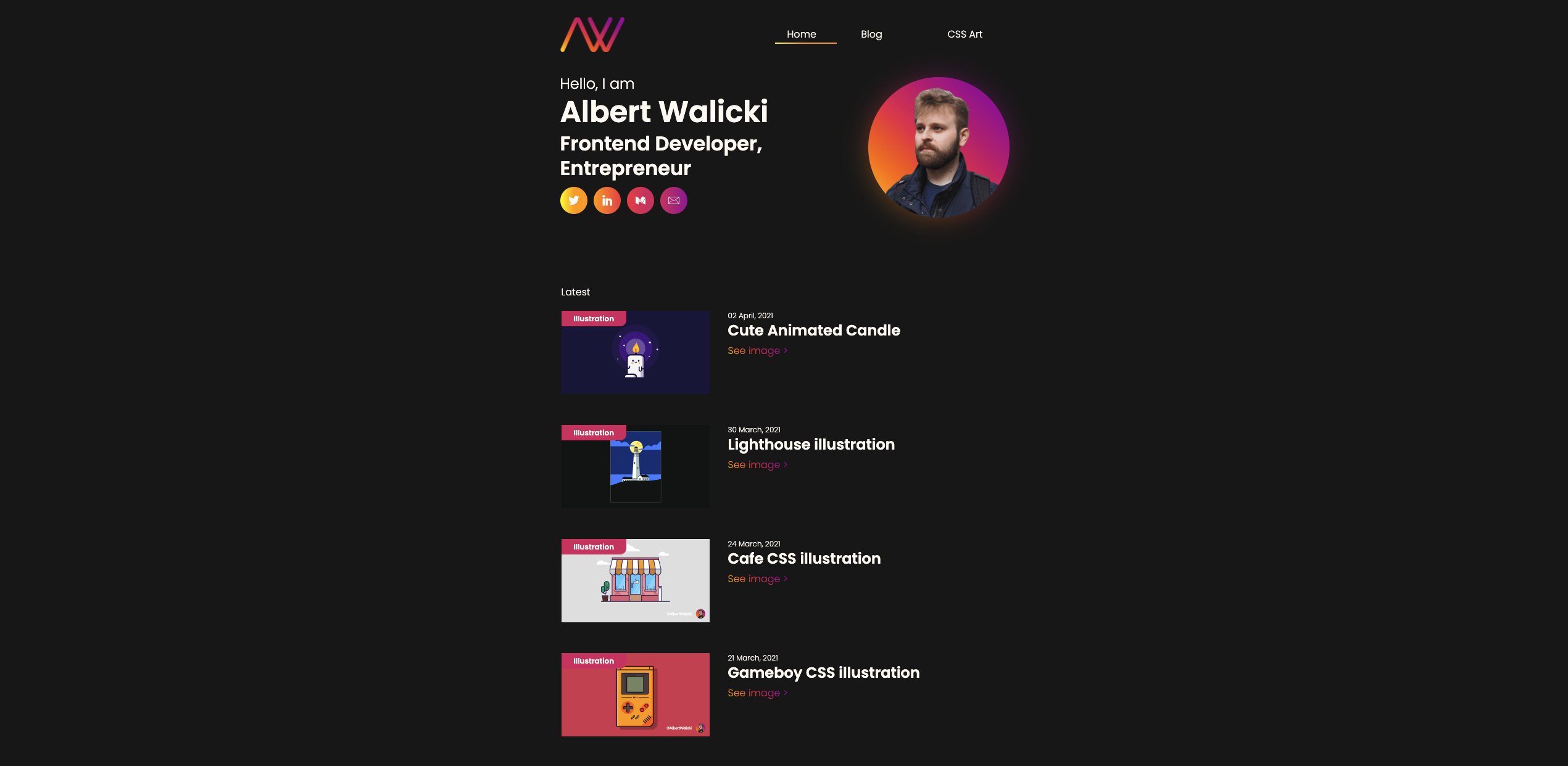
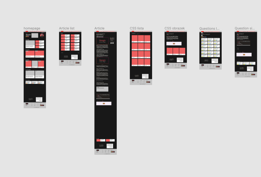
On my new blog, I decided to change colors a little bit. You can compare my previous website with the current one.
Hello, Next.js!
I have been working with Next.js since version 6 (released 16th May 2018), and currently, it's my default React framework. A few months ago, I had a project with Create-React-App, which was a nightmare. I'm not an anti-CRA. I didn't use CRA for a long time and forgot how to use it. For me, the Next router is much more intuitive than React default routing.
I love how Next.js handles server-side rendering. I wrote the entire app with the backend inside Next. It might not be wise to do it, but this app is only for me, so I don’t have to worry about security and all this stuff. I’m not a backend developer. My backend knowledge is limited to the basics of Node and Python.
The Design
It’s hard to design anything if you are 100% technical and 0% creative. I can’t even draw a circle or 4 x 90deg square by myself. I could use some help from designers from our company, but I didn't want to wait until they were free. So I decided to do it independently, like the previous design.
First of all, I planned what I wanted to have on every blog page. I used Notion to jot down all the ideas, and after a few days of thinking, I started to do some research. I spent several hours on Dribbble to get inspired and find all the best solutions for my new blog. Then, I began to do some basic designs in Figma.
I have planned and designed more sections, but this will have to do for a start.
I had some feedback and design consultation from Diana and her help in designing the first section on the homepage.
Headless CMS
I have some experience working with MDX, so I decided to continue using MDX. My blog started looking good and it was working on my local machine. So, the next step was to test it on the production environment.
There was a problem with serverless functions. I wanted to have "Load more articles" button at the bottom of the page. But something wasn't working. After a few hours of debugging, I found out that I wouldn’t be able to use serverless functions with project files (fs node).
This cite is from Vercel documentantion:
On your local machine, you have access to a persistent filesystem that you can read from and write to. This is not the case for Serverless Functions. Serverless Functions are stateless and cannot be depended on as a storage solution.
The proper approach is to leverage an external storage solution that you can query from your development, preview, and production environments through a consistent interface.
Well, fuck.
I had to change my entire project and started using some CMS. I choose Storyblok because I have experience with this CMS, and it’s pretty good for my needs. I use Storyblok for article metadata (like main image, title, lead, dates), entire illustrations, tips, and solutions.
Performance
My goal was to create the best app ever, with the best optimization I ever had. According to Google Lighthouse, my score on mobile phones is around 98/100 points. The score will be even better when Next.js updates its framework to work with Emotion. Next 12 is pretty new, and I can't use their new Rust compiler because it doesn't support Emotion yet. And without a more recent version, I can't use AVIF images.
Images
I serve all my images with Next/image and custom size config. It helped me to reduce the size of images by ~50% on each!
This is my next.config.js. I'm using next-compose-plugins for easier management.
const withPlugins = require('next-compose-plugins');
const withPreact = require('next-plugin-preact');

const redirectList = require('./utils/redirectList');

const nextConfig = {
  webpack: (config, { defaultLoaders }) => {
    defaultLoaders.babel.options.plugins = [require.resolve('@emotion/babel-plugin')];
    return config;
  },
  async redirects() {
    return redirectList;
  },
  images: {
    domains: ['a.storyblok.com', 'img2.storyblok.com'],
    imageSizes: [16, 32, 64, 128, 256],
    deviceSizes: [320, 375, 414, 512, 630, 768, 828, 1024, 1080, 1200, 1920, 2048, 3840],
  },

};

module.exports = withPlugins([withPreact],nextConfig);
The image config is here:
const nextConfig = {
  //...
  images: {
    domains: ['a.storyblok.com', 'img2.storyblok.com'],
    imageSizes: [16, 32, 64, 128, 256],
    deviceSizes: [320, 375, 414, 512, 630, 768, 828, 1024, 1080, 1200, 1920, 2048, 3840],
  },
  //...
};
I support 18 different browser sizes out of the box! Isn’t it amazing?
This is an example of usage:
<Image
  src={featuredPhoto.filename}
  alt={featuredPhoto.alt}
  priority={true}
  width="724"
  height="408"
  sizes="(max-width: 340px) 128px, (max-width: 430px) 320px, (max-width: 630px) 630px, (max-width: 768px) 828px,
(max-width: 1024px) 1024px, 1024px"
/>
That’s how images of the current articles on screens smaller than 430px weight ~5kB compared to ~24kB on desktop. Almost five times smaller images are served on mobile phones.
Preact
Did you hear anything about Preact? Preact is an alternative to React. It can allow reducing bundle pack by 35-37 kB. You can switch to preact unnoticeably in most cases. Reduced bundle weight - that's the reason I use Preact. There are some differences, and you can read more about them here: Differences to React.
Blog or a platform
I’m not too fond of blogging platforms for one reason - they are for blogs. You can’t have any custom components inside. That’s why I initially post everything on my blog, and then I repost articles on Medium and Dev.to.
But what about different types of content? I use Twitter and CodePen for different types of content. But on Twitter, my tweets are deep down in the Twitter database. It’s hard to find any specific tweet, for example, a tip created five months ago.
That’s why I expanded my website.
Illustrations
I also had illustrations in the previous version of my blog, but they weren’t that highlighted as I would like them to be. On the homepage, I had one flow for all types of content - articles and illustrations were together.
I knew that I had to split them into two sections. That's how I made my new homepage. It allowed me to think about different types of content.
I also started building my side-project called CSS city. The idea was to make a lot of different buildings and use them in one project to create a CSS city. So far, I have a few buildings and trees.
Tips and tricks
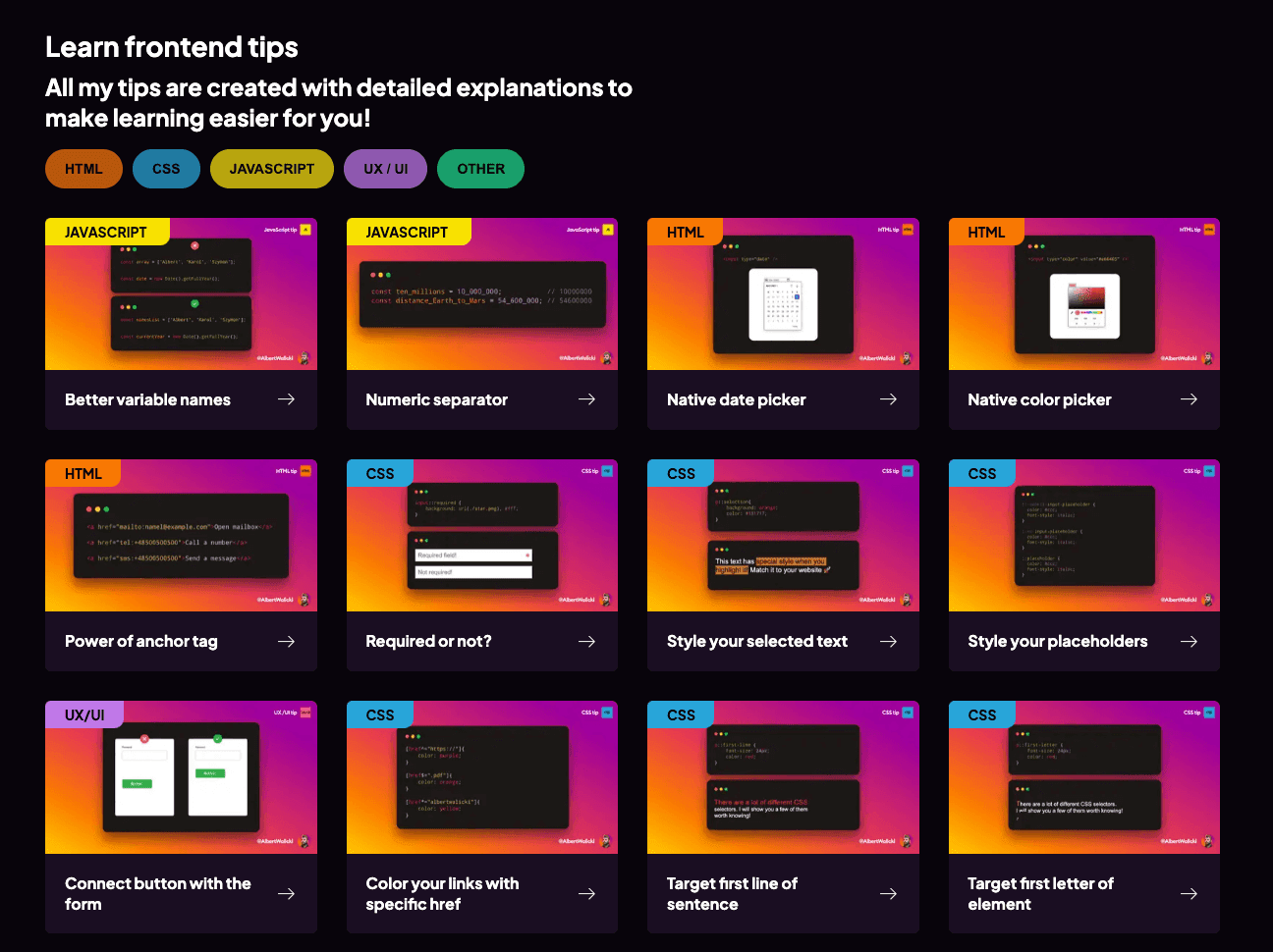
I’m not as active on Twitter as I used to be and should be. But some time ago, I was posting many different Frontend and Design tips. And right now, no one can find them. I spent a lot of time creating them using Figma, and I didn’t want to waste that time.
That’s why I created this page, to gather all of them in one place and filter them by category.
Solutions
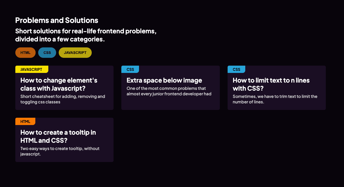
I have over five years of frontend experience, and every time I need to use a Switch statement, I need to google it. That’s normal. You don’t have to remember everything. Much more important is to know how to find a solution for your problem on the internet in a proper amount of time than remembering everything.
Therefore, I came up with an idea to create a collection of standard and basic questions I had as junior developer. Of course, I also gathered solutions to those problems.
Youtube and Twitch
I was thinking about starting a Youtube and Twitch channel for a few months. I already bought everything I need: a webcam, microphone, lighting, green screen, but I still didn't do it. Why? First of all, I want to finish one of my most extended projects. It's about to finish, but every day our backend guy figures out a new bug and edge case to fix. When we finally finish this project, I will take two weeks' holiday to clear my mind, and finally, I will be able to create more content.
My channels are empty now, but that's how you can be one of the first subscribers before I become a super-youtube-star 🤣. You can subscribe on Youtube and on Twitch.
I will create more detailed and strictly technical articles about my blog in the future.
Thank you for reading, and see you next time!